


Introduction
For my exam i chose low light because i think that it looks cool. This is because of the way that the images are represented like its almost a mystery that about to be solved or getting new leads. This sense of suspense is intriguing and makes me want to investigate more and leads me to looking deeper into the image and finding out more about the image the longer i look at it. It is also good because it leads to more people that have similar minds to take an interest in this topic and it will lead to them looking deeper into this topic and finding more about new artist that have projects with this topic.


These images are really interesting to me. This is because of the way that it makes you look closely to find out what the main focus of the image is. This also makes people spend more time looking at the image and makes them want to look at more images from the same artist. I also like how that the images make it seem like a mystery and makes me want to investigate the image and find out the little details in the image and then put the image together almost like it is a puzzle. I think that this is very good as people that find their work interesting will go ahead and look at more of their work and maybe suggest the artist to their friends. This will lead to more people finding out about the great work that they do.
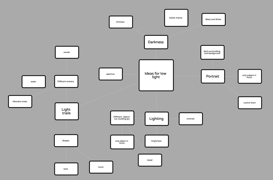
Ideas for images
Liam Wong


Liam Wong's work caught my eye straight away. This is for many reasons one of the being the setting. I think that the setting is really nice and they way that he took them is unique from what i have been seeing. I think that this is because he uses vibrant colours with the low light so that the background of the images stand out more. Another reason why i really like his work is because of it having a lot of vibrant colour. I have already said this but it is not just in the setting of the image it also in the image as a whole. the colours pops out and stand out from the rest of the image. It also adds a nice effect on the people and object that around the area and makes them look colourful.
Single image evaluation

|
This image was taken by a photographer called Liam Wong. He takes a lot of images like this one and i like them a lot. I think that this is one of his best images that he has taken. The reason why I really like it is because of the position of the camera. I think that having a higher camera position really adds depth to the image. I also like how the orientation of the camera is landscape. I think that it really shows off the beautiful environment that the image is taken in. I feel if the image had a wider angle of view it would make the image better. Another reason why this is one of my favourite images by Liam Wong is because of the Authenticity. What i mean is that i think that these images are better as the people in the images a being real and not faking because they know they are going to be in a photo. I think that this brings out more of the environment and makes the image a lot better.
|
Yousuf Karsh


Yousuf Karsh is another artist that caught my eye immediately. This is because of the way he using light with the low light to make shadows. This effect is cool to me because it makes it look like 2 different types of image that wouldn't be portrayed properly in a normal image. Another reason why Yousuf Karsh caught my eye is because of the people. This is because of the way the shadows are on there face and just how the surroundings around them allow the person to stand out and be the main focus.
Evaluation of an image

|
This image was taken by a professional photographer called Yousuf Karsh. He takes other photo like this if important or popular figures to the public. I like this picture for many reasons and one of them being the way the camera is positioned. I think that facing the camera straight at the subject at eye level really makes the image pop out and make it look like the subject is standing right in-front of you. I also like it because of the tone of the image. With it being in black and white and the lighting being really dim i think that it makes the image more unique then a regular portrait. Finally i think that the pose the subject is in is unique compared to the other photographs that he has taking. This is because of how he is posing and the way the subject is facing. I feel like the pose goes perfectly with the way the subject is facing. This is because the viewer can make out instantly what the photographer intended to mean with this image. Whereas if the camera with facing directly at the subject it would be a lot harder to tell. Overall i think that with all the different things listed they complement each other in amazing ways and just bring the whole image together.
|
Experiment 1


To make these images more like low light i am going to probably lower the contrast around the main focus of the image and then make the main focus stand out more. I also will probably change some of the images to black and white and see what i can do with that.


This is the editing process that i used for the images below. What i did was that i went on to change the contrast and while i did that i also lowed the brightness and then i made the contrast higher.


I think that most of these images came out good. If i was to do this experiment again i would probably change some things. One of the things that i would do different is that i would not only take images of the environment but of people aswell. Another thing that i would change is that i would take images at night. I think that by doing this it would make the main focus of the images stand out more. I could also maybe try to change around the main colours of the images and maybe even try and change the exposure to make it lower and the brightness higher. i think that the next time i take some images i would use people and change the lighting in the room to make the subject stand out well.
My Favourite Image

This is my favourite image from the group above. This is because it relates too low light the most. I think that this image is good as-well. This is because of the way that the tree is just the only thing that is around. This makes the image feel like almost a gothic theme if the building wasn't in the background. This is because when i picture something as gothic I normal think of an old and lonely environment and things that are on the outskirts of areas. Overall i think that all the images are good but would look much better with even less lighting and maybe even if they were in black and white.
Melissa Breyer


I really like the photographs that Melissa Breyer produced. This is because of the way that the images all have something that is in common which is that they feel authentic. What i mean is that the images feel like they could be taken and the subject wouldn't even realise that they are being used for a photograph. I also like how although the subject (the person) is the main focus, the environment also plays a huge role in being part of the image and almost tells a story of what going on. Another thing that i like is that the images have been taking in landscape. I think that this was a very good choice because the photographs seemed as if having a wider viewing range makes the image feel more engaging and makes it feel like i'm actually there.
Experiment 2
For this experiment first i am going to take portraits. When i take these portraits i am going to use artificial light to do different effects on the subject such as creating shadows in different positions. Once i have taken the images i will use photoshop to change the images into black and white.
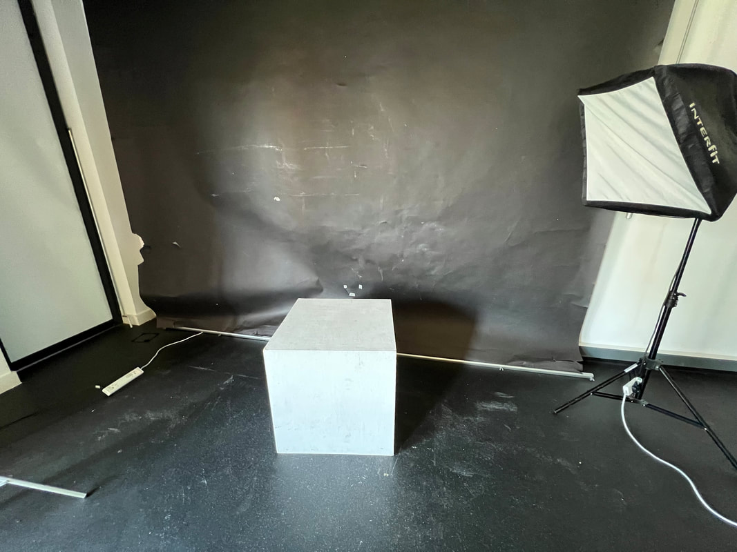
This is what i did to set up the set to take the images. I also lowered the blinds to make the room as dark as possible.


I am going to edit this images by changing it into black and white. then i will lower the brightness and increase the contrast and hopefully they come out nice.


This was the process of making the images


I think that these images came out very well. This is because i feel like all of the elements of the image just fit together very nicely. like the way that the light aluminates the subject as created a nice effect on the subject. Also with the way that the subject is positioned. I think that this takes the image to a whole new level and almost makes the image more natural even though it was planned out. I also think that even with these simple positions it makes the image look better. This is because with the more complex poses i feel like it makes the image feel even more staged and ruin the simple and effective theme. If i were to do these this experiment again i think that i would try and do different colours on the light to create a darker glow on the subject. Another thing i might do is add another light source. I think this will elevate the images as it will create a much bigger shadow on the subject.
Single Image Evaluation

|
This is my favourite image out of the group above. This is mainly because of how the lighting is positioned. This is because on the left side it is mainly dark and as it moves more to the right it gets lighter and lighter. I think that this makes a very nice effect. I think that this images is effect because of other factors also. Another is the way the subject is positioned. I think that this works well because it goes well with the light as it bounces of the subjects face which look good. I think that if i was going to do it again i would change some things. One of them being that i would try it with even less or no light at all. I think this would achieve something even better than what i produced today. Another thing that i would change is that i would ask the subject to pose in more positions.
|
Todd Hido


My first impressions of the these images was that i felt as if that the images could almost tell a story about what Todd Hido is like. What i mean is that i feel as if although i have never met the artist i feel as if i know what he would be like and how he would act. I really like these images because of the style of the images. Although they are very simple and minimalistic they still have a big impact on the viewer. I also like these images because the are all taken of places and things that you would find around your area that you live in.

|
This is my favourite image from the series of images above. I think that this one is my favourite because of how simple and minimal things in the image. i think that the way the camera is positioned is very affective as well. This is because with the camera positioned to the side of the door and chair but still facing it straight on is much more effective then if it was below or a birds eye view. I also think that the image being in full colour is much more effective ten if it was in black and white as it adds more depth to the image. I think that the focus of the image being on the door and chair is very effective because it makes the viewer think more about the surrounding area and what might be there.
|
