Introduction
Personally I don't really have a relationship with nature as I just don't find what there is to it. But there is one thing that I enjoy about it and that is the peacefulness. this is because when you are with nature there is not many distractions that are they and you can just focus with temptation. from what people tell me it can help a lot for many different reason. Some of which they told me are that it can help you escape from reality, It can help you have a clear mind and focus it can also show you things that you might not normal see. If I had to go somewhere to go and see a landscape I would probably go to somewhere with a lot of mountains. This is because in the mountains there wouldn't be that many people there so it wouldn't be that noisy. It would also be a great place to go and see the surrounding area as you would be high enough (depending on where you are). I think that people take pictures of nature because it is a great way too capture a specific and special moment in time so that you can go back and have that forever. i think that taking photographs can help change the way we see things. This is because photos can bring out things that we over look in our day to day life. such as the environment and our surroundings.
Landscapes


The Idea Of Landscape


|
In the image the photographer has included tracks from a car which could mean that its showing the journey to his destination.
The relationship that the photographer might have with the image is that the destination that they are at is empty and quiet so he might go there to relax. The vantage point that the photographer uses is low. i'm saying this as you can see the ground close up to the camera and cant see that far. i think that we are close to the landscape as it big in the image. I think that the photographer tried to represent the feeling of emptiness. This is because there is nothing there and its just land. |
In the image the Photographer has included a man rinding a horse but what we cant see is where he is going/coming from.
The relationship the photographer might have with the image is that he might relate to the man riding or maybe to the horse. I think that the vantage point is at a medium hight. This is because of the way you can see the sky clearly and see some of the ground. I think that we are close to the subject. This is because you can see him close to the camera and doesn't look far away. I think that the photographer tried to represent the feeling of loneliness. This is because its just a man and a horse with no-one but himself. |


These images where taken with the intent to be taken while having something that makes it bad. What i mean is that the images have something that is normally not a good idea to be in the image. With that i think that the images came out well
Landscapes


Constructive Landscapes


I think that images are effective.this is because the way that the surrounding area is blending in a little bit with the cutout image. I think if someone was to give me feedback on this project is that the cutout is a bit scruffy and it should be a bit more neat. i think this because in the image you can still see a tiny bit of the sky that was in the background of the cutout. I think that something worth remembering about this project is the way you have to cut out the background of the image. This is because if you are not careful with cutting out the background. I have learnt that with this project you have to take your time with the cutting out and have to be careful with choosing the environment in which you take the image. I say this because if you choose something if you just go to random places then the cutout might not work in that environment and it might just look out of place. To refine this i would probably do two things. One of them being to take more time with cutting out the background of the cutout And the other being taking more images and choosing the background more carefully.
Constructed Seascapes


Both of the Images above can be be described as landscape picture. the landscape that the images describe is a sea or ocean landscape. some of the similarities of the two images above include that there is minimal colour in the images as the one on the left is black and black while the other image is like a worn out white colour. Another similarity would be that the images contain similar content such a sea land and rocks. one difference that I noticed straight away is that the image on the left is constructed while the image on the right is natural. What I mean by this is that the one on the left most likely took more effort to make than the one on the right. This is because when you are making something it takes more of your brain to think of creative ways to make and change the image, you will also have to take the original image which will also take creativity to find a good spot to take the image. Another difference that I noticed is that the colours in the images are different, the image that is on the left side has more bright colours while the colours on the right are more monotone and dull. A word that I would use to describe the image on the right is vintage. I say this as it looks very old fashioned and worn out while as the image on the left I would describe as more thought about and crafted. Personally for me I wouldn't want to live on either of these landscapes but if I had to choose I would say the one on the right. the reason why I am saying this is because the one on the right looks more nice and in the background you can say that it is maybe a pier of a beach or maybe a island. while as with the one on the left it looks more like just sea and not much land. so overall I would rather live on none of them but If I had to chose It would be the one on the right.
Dionne Lee Draft
Drafts from Dionne Lee on Vimeo.
The work was different because it keeps on changing there it is never the same. the art was made by getting images from different things and then ripping and changing the images and putting them together. It relates to constructive landscapes as the images that she was using were mainly of buildings and the environment. it was different from conventional images of a landscape as it wasn't just landscapes there were different things thrown in there to change up the style. the images that she used were from magazines and probably some that she took.
My version of the type of art that Dionne Lee did went fairly well. it was a bit strange at first because you kept on having to change the art and you couldn't stick it down so it kept on moving around and it was a bit annoying. it was also strange as you had to keep moving and you couldn't just sit there and think as the video was always rolling so any time that you are still it was just a gap and it made some inconsistent pauses. it went well in the first half as I had a lot of ideas but as time went on and as I had a limit on the amount of images that I could use it got a bit old at the end as I was using the same images. if I could change one thing about it I would give myself more images so that I had a wider spread of images to be more creative with.
Bill Armstrong


6 facts about Bill Armstrong
- He has been taking the infinity series photos since 1997
- He study in B.A., History of Art, magna cum laude, Boston University, 1979
- later than went to M.B.A., Boston University, 1987
- he makes his photo with the focus lens set to infinity
- he using the process of manipulations by photocopying cutting painting re-photographing
- with extreme blurring it makes the edges within the collages disappear
Ray Metzker's


8 Things That I Like About His Art
- I like how Metzker's art has some interruption in them
- I like how Metzker's art is abstract
- I like how all Metzker's images are different from each other
- I like how Metzker's art is thoroughly thought out and taken in a good standard
- I like how Metzker's art is in black and white as i think it adds depth to the images
- I like the way Metzker's has his own kind of way of taking the photos
- I think that the way that Metzker's views the landscape is interesting as it is different from the most
- The image i like the most is the one with the head in it this is because he changed what would be an annoyance to something that actually means to be there
My interrupting images


What i like about my images is how they are taken and the way they have come out. I also like the way that the images are mostly unique to one another. The things I used in my images are very common objects that you could easily found around your house or just around your area. It has some connection with Ray Metzker photo series pictus interruptus as his images also have some sort of object in-front of the lens when the image is taken. If i could retake this task there is a few things that i would change. One of them being that i would just take more images. Overall i think that this project went ok. When i do this again i think that i am going to try different things and use different things (maybe like a cut and crumpled piece of paper).
The reason why i chose to change this image into black and white is because out of all of the ones that i tried it looked the best. I like the way that the image has turned out
Jon Divola


10 Facts About Jon Divola
- He was born 1949
- He was born in Los Angeles
- He received a B.A. from California State University, Northridge in 1971
- received an M.F.A. from University of California, Los Angeles in 1974
- He has held the position of Professor in the art department at University of California Riverside since 1988
- His work has been featured in many solo exhibitions across United States, Europe, Japan and Australia
- Divola received awards as Individual Artist Fellowship from the National Endowment for the Arts in 1973, 1976, 1979, 1990 and a Guggenheim Fellowship in 1986
- He published four books: Continuity, Isolated Houses, Dogs Chasing My Car In The Desert, and Three Acts
- He photographed the ocean from the house's interior through windows and cracks
- Divola's photograph Zuma was used as the cover art for Atlanta-based rock band Deerhunter's 2015 studio album Fading Frontier
charles Wilkin


My first impression of Charles Wilkin work i good. I like the way that he has made is collage by re arraigning the image he already has then added something to fill in the blank. I also like the style that Wilkin has used. I like that he has made ordinary images into something that is more interesting to look at. I think that these images are very effective as they attract attention at a quick glance. This makes the images effective as if people have a quick look and find it interesting they are more likely to spend a bit more time to look at the images and will mostly likely find things that would make them want to look at more of the artist work.
My interoperation


My initial thoughts while making the images was to try and find things that would fit together and bring the focus to where the objects in the image are. While making the art i was trying to make the images unique and make it stand out. After finishing the art there are a few things that i could do to improve the collage. 1. add more detail and fill up more space. the reason being that the background of both of the collage is quite bland and doesn't look very good and is not very eye catching (this could also be a good thing as it would bring more attention to the the objects that are making the collage) 2. add different objects and maybe use the background as part of the collage. What i mean is that taking things that are in the background to add to the objects or just maybe flipping half of the background and leaving the other half normal. Lastly 3. doing more images. I will be doing more and experimenting with them.
Final project
Kate Woods


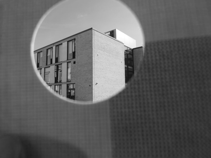
My first impression on her work is that it is very eye catching. This is because of how the middle of the image has a shape that wouldn't normally be in a standard image. I like the images that Kate Woods has made for many reasons, one of them being the way it looks. What i mean is how the two different images come together almost like it could actually be there and that it is part of the environment. Another thing that i like about the images that they took is the contrast between the the image and the other image. What i mean is how if there was no "outline" you wouldn't be able to tell that there are separate at a quick glance. So if you where just to quickly look at the image it would look normal but if you actually take a bit of time to look at it properly then you could see that the photographer took the time to think about what it would look like and its not just an ordinary image. I think that her work is effective. This is because as i said before it is very eye catching. This is a good thing as people would want to look more into the art and maybe if they like it they would want to look at more of her art.
My interpretation


With these images i plan to change the some of the images into black and white then cut them out and overlay the original image to make a affect of the images have been taken out in the darkness to hopefully make it have a good contrast between the two images (the original and the edited).


With these images i plan on cutting out a hole in the original images that are above these and then placing the edited ones under these. I am doing this so some of the edited images will show through the original one and hopefully it will have a affect where it looks like the image underneath is part of the landscape and it will look like it was darker in the place.


I think that these images have came out ok. they are not what i imagined but they still look good. I think that the reason why is that it was hard to figure out how to do it and it was also hard to get the right shape and i have no way to get the image 100% correct and accurate. I think that if i was too do this again I would most definitely find a more accurate way of doing it. With all that said i do still think that the images came out good. Also the process although a bit frustrating was rather fun.
AI Text To Image


To create these images i had an AI make a place that i had typed up (text to image) then it a couple of attempts to get something good but then it made these. Im not really sure on what i am going to create with these but i think i might make it so that one of the images has some sort of piece of card infront of a projector to make it look like it is being obstructed. For another one i think that i might stand infront of the image and then photograph myself so it looks like im looking up into the world.


I think that these images came out good. I think that i can improve on them though. what i think that i can do is that i could generate some more images and then i could try different things maybe without using the projector. Im thinking that maybe i could use photoshop and maybe layer some of the images or maybe i could edit the images so i involve something that i like so it can be more personalised for me.


These are the final product of the AI Text To Image work that i done. I think that they have came out well. i really like how they came out. This is because at i first had experimented with different types of ideas before i came to these images. I think that this really helped me because i got to see what i liked before i finalised what i would do to finish of the AI Text To Image project that i had done. Overall i think that they came out good and if i was going to do it again i think that i would try to merge similar photos what the AI gives me with one that i take myself.
